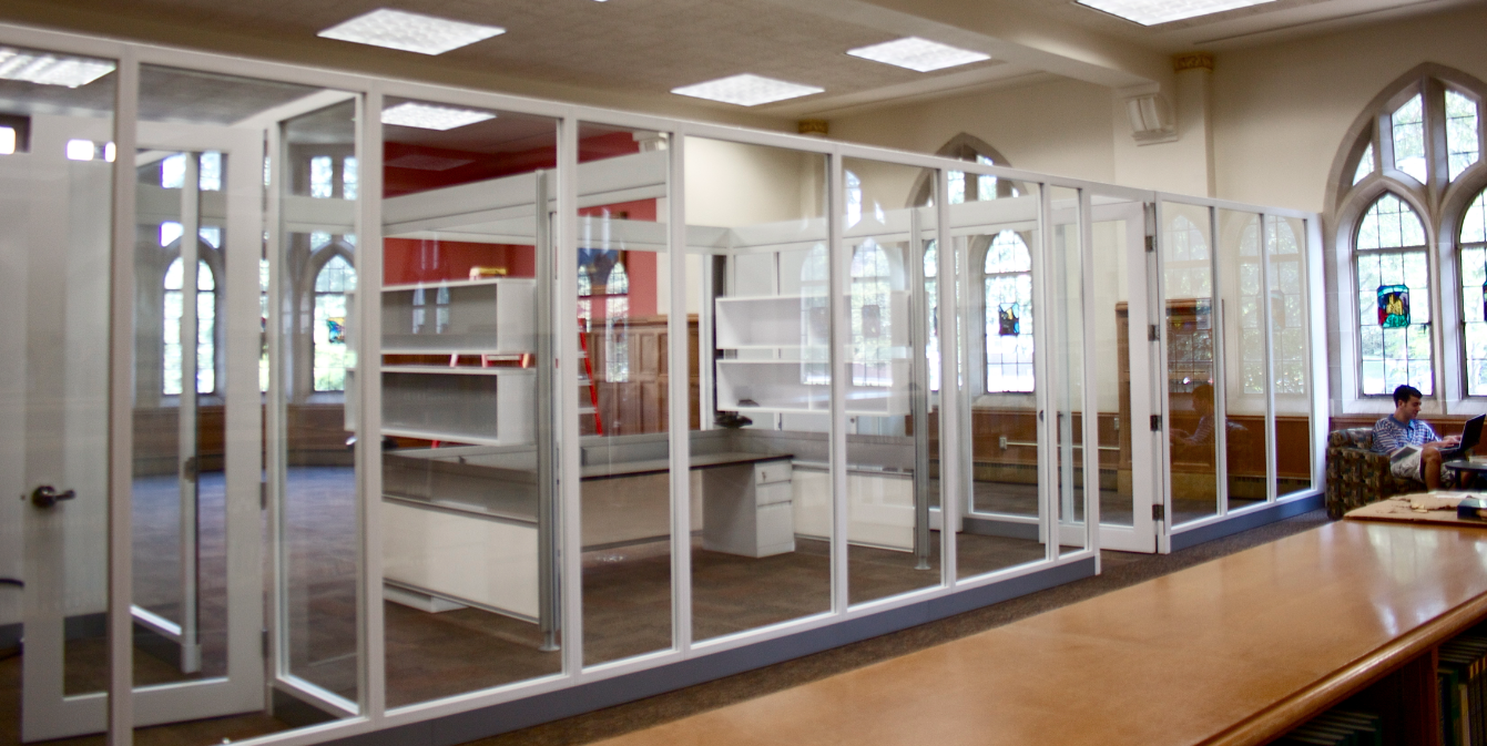
In four-to-six weeks, the O’Shaughnessy-Frey Library media center will be revamped and moved to the first floor of the library across from Coffee Bené.
Director of St. Thomas Libraries Dan Gjelten said moving the media center was a decision largely based on staff cutbacks and budget cuts.
“I needed to consolidate services on the first floor where a lot of the staff are so I could have circulation staff here who could also provide services for this collection,” Gjelten said.
The media center, which consists of educational videos that both staff and students can check out, started years ago in the O’Shaughnessy Educational Center. It moved to the third floor of the library in 2002, and last year to the first floor behind the circulation desk. The new center is set to open in 4 to 6 weeks.
Junior Jesse Stone said he thinks the media center will offer more resources for students and staff to use.
“I think it is a good idea because it will allow students easier accessibility for educational resources,” Stone said. “It may condense study space, but I think it will open … options for educational resources.”
Although taking up the first floor space eliminates some studying space, Gjelten said the new location was necessary because past locations didn’t have enough room to hold the vast collection.
“It’s tight and cramped (behind the circulation desk). There’s no room for growth,” Gjelten said.
Circulation Supervisor Karen Batdorf agreed that the last three locations were not “visible” enough.
“I think when we were on the third floor, it wasn’t immediately visible,” Batdorf said. “When it’s down here now, it’s more visible.”
Junior Harry Aslesen said he has witnessed some of the transition.
“I think it’s awesome,” Aslesen said. “I think it will be a great resource for students. I never knew that the library even had video service, so I’ll for sure check it out.”
Gjelten said the new center will have several new additions as well.
“There’s actually going to be one TV, and there are going to be computers back there with DVD players so you’ll be able to watch them on a computer,” Gjelten said.
With everything becoming “digitized,” Gjelten said one of the advantages of the collection is its mobility.
“It’s not even connected to the floor,” Gjelten said. “It could be taken down; it could be repurposed down the road if all (the videos) becomes streaming and available online, which it will.”
Senior Mary Rogers thinks a larger location for the media center is a waste, especially since the center will take up a popular study spot.
“My friends and I liked to study on the first floor and during finals it’s probably going to suck,” Rogers said. “I don’t think I’m going to be checking out any educational movies; that’s what Netflix is for.”
Gjelten acknowledged that the first floor was a great spot to study, but said the library is creating other spaces to compensate.
“What I would say is that this space makes perfect sense for the media collection,” Gjelten said. “We’re developing other kinds of spaces for students all over the place.”
Kayla Bengtson can be reached at beng2004@stthomas.edu.

Who was the designer that threw in those metal poles and windows? I think thats an absolute eye sore in an otherwise beautiful building, not to mention taking away from the spaces to study.
So, because of “staff cutbacks and budget cuts” the University sees a need to spend tuition dollars to create an even bigger potential disaster of a media center? I agree with Mary Rogers on this one.
I see what they were trying to do here, but why cut off a highly trafficked area of the first floor? Design should complement an existing structure rather than detract from its positive elements. I believe there is a better solution available for students looking to reference video resources. Popular films are available in most, if not all the dorms. It would seem to make more sense to organize the library like a library. Relocating the Media center to a different level with less visibility would still allow its materials to be referenced with the same ease as any other book. Either redesign it or relocate it, but please don’t leave it as it is. It could be beautiful, with the structure’s versatility the decision is up to you. STUDENTS. FACULTY. ADMINISTRATION. Tell someone if you want to see a change, passivity and indifference never resolved a conflict.
Junior*